OLYMPIC GAMES
A data visualization about 120 years of olympic history
TIME
march. – july. 2022
COURSE
Programmed design 2
TEAM:
Lena van Maris
SUPERVISION
Prof. Hartmut Bohnacker
TOOLS
HTML, CSS, Javascript, Figma
MY TASKS
Design of Data, Research, Concept of Interaction, Programming
PROCESS:
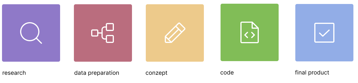
Using the Programming Design 2 course, we learned to visualize a dataset using JavaScript and jQuery. In addition, we worked with the gmynd library. By using colors, shapes, arrangements, animations, we should filter out important information and map connections.
TOPIC FINDING:
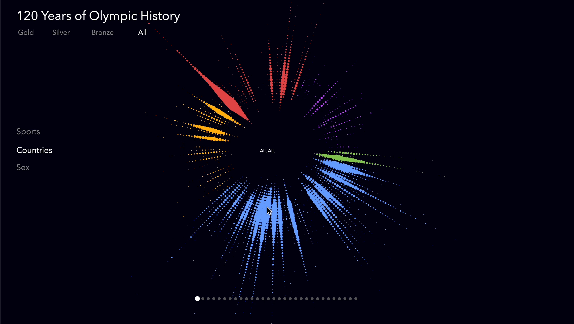
At the beginning of the project, a suitable data set had to be found, which was to be visualized. Thematically, there were no limits. One should make sure that the dataset contains enough different parameters, and thus allows multi-layered representations. During the search for a topic, I came across the “120 Years of Olympic history: athletes and results”. This is a historical dataset on the Olympic Games of the modern era, including all games from Athens 1896 to Rio 2016.

PREPARATION OF THE DATASET:
The first step was to filter out all the most relevant parameters from the large data set for the first time. I decided to focus only on the winners of the Olympic Games. Before I started visualizing the data graph, I thought of several interesting questions, which are as follows:
AGE
At which age are there particularly many winners and in which sport do they occur?
COUNTRY
From which country come, the oldest and from which the most medal winners?
SEX
Are there more women or men who win and what ages are they?
CONCEPT:
After preparing the data, I continued to work out my concepts in Figma. Here I was able to familiarize myself extensively with suitable shapes and arrangements.

Graphic with the sports:
The three parameters were the age, the sport and the number of medals. I then made different sketches of these parameters. In the process, I came across this way of representation, where in each case a beam stands for the sports and on which the age from young to old can be seen and in each case the thickness of the points shows how many medals were won per age.

Graphic with the countries:
After the first graphic was created, I tried to replace the parameter sport with the parameter country. This way you can quickly see which countries have won a lot of medals and which countries are more likely to win older ones.

Graphic with the sexs:
Finally, I have shown the whole thing again with the gender parameter. This allows you to see in which age more women win medals and in which more men. If you hover over a point, you get the point of the other sex also shown. So you can compare the two very well with each other.
In the end, a programmed interactive data visualization was created.
With the help of this video we were able to make our concept easily accessible and understandable.
_____________________________________________________
WHAT DO YOU WANT TO SEE NEXT?
______________________________________________________

UnitedHands

Radial Calculator

dufte

Pal Fridge

ARD Mediathek Redesign