ARD Mediathek Redesign
A new personalized Mediathek with a new and fast search
TIME
oct. – feb. 2022/23
COURSE
Application Design
TEAM MEMBERS
Elisa Moder, Philipp Roser, Lena van Maris
SUPERVISION
Sandra Raab
TOOLS
Figma, After Effects
MY TASKS
Research, Concept of Interaction, Design & Prototyping
Compared to other modern streaming services, there are some weaknesses in the usability of the ARD Mediathek. In order to integrate the wide range of user groups and make the Mediathek more attractive, we took on this task for a redesign.
PROCESS:

RESEARCH:
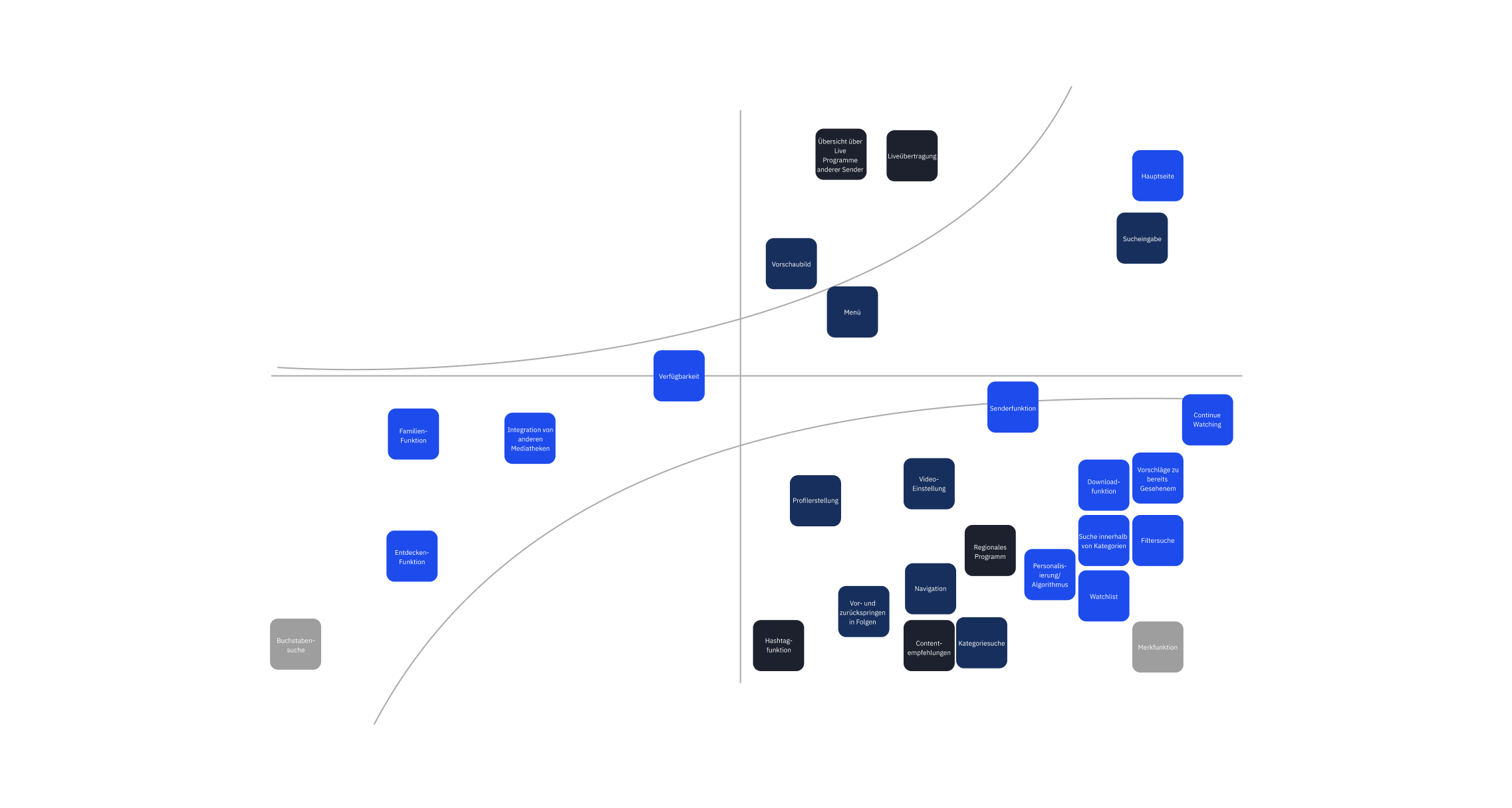
In order to get anoverview of entire app with all its features and functions at the beginning of the redesign, we analyzed the app’s weaknesses. We defined those weaknesses by different methods like competitor analysis, user testing and others:
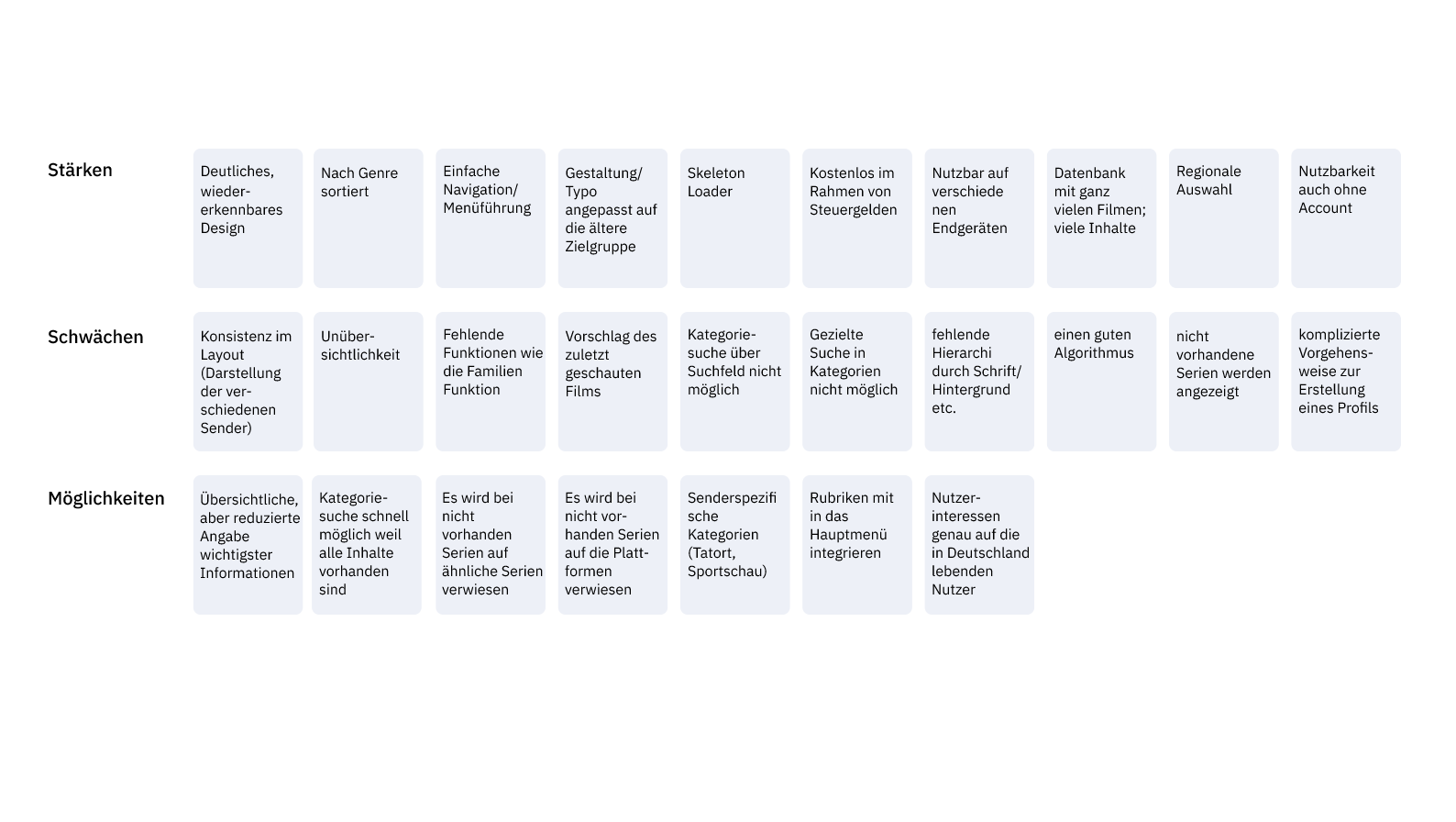
SWOT-Analyse
Strenghts, weaknesses, opportunities of the application
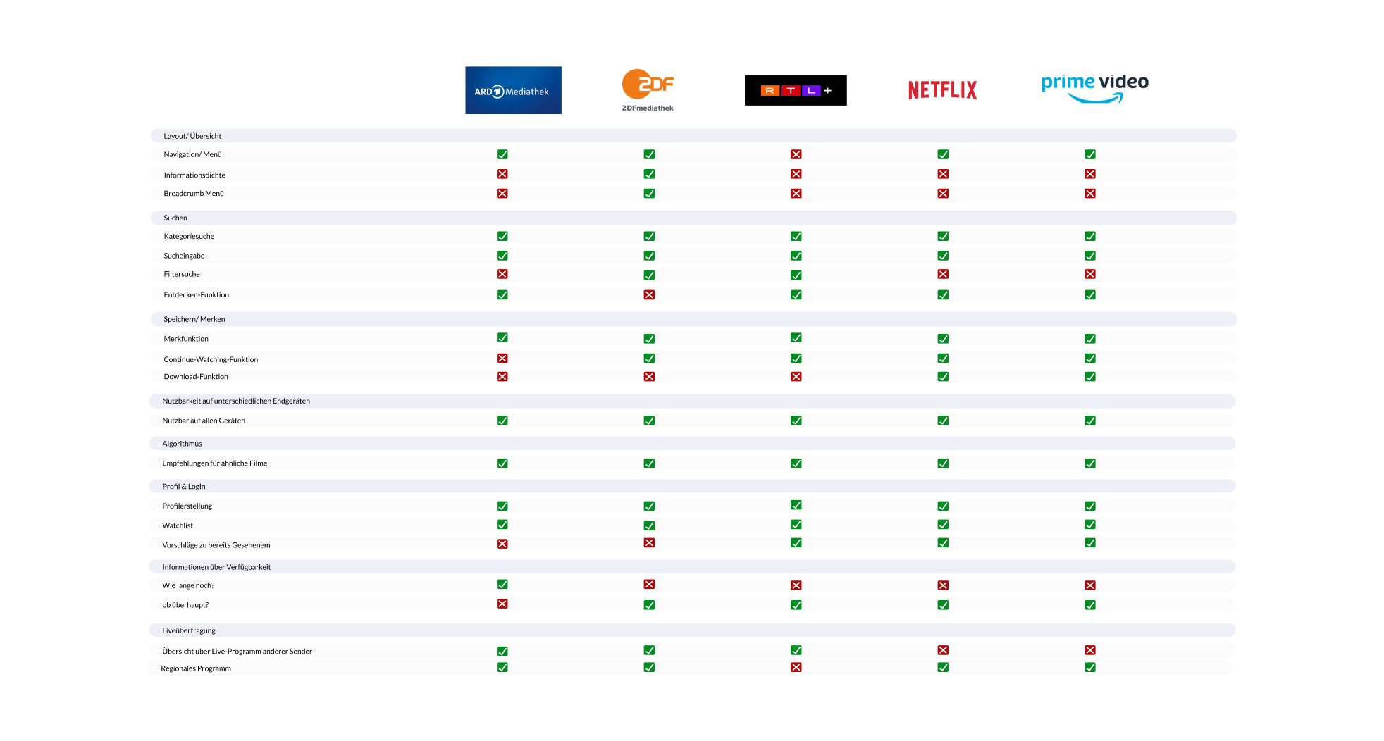
Competitive analysis
Understanding the market and their goals
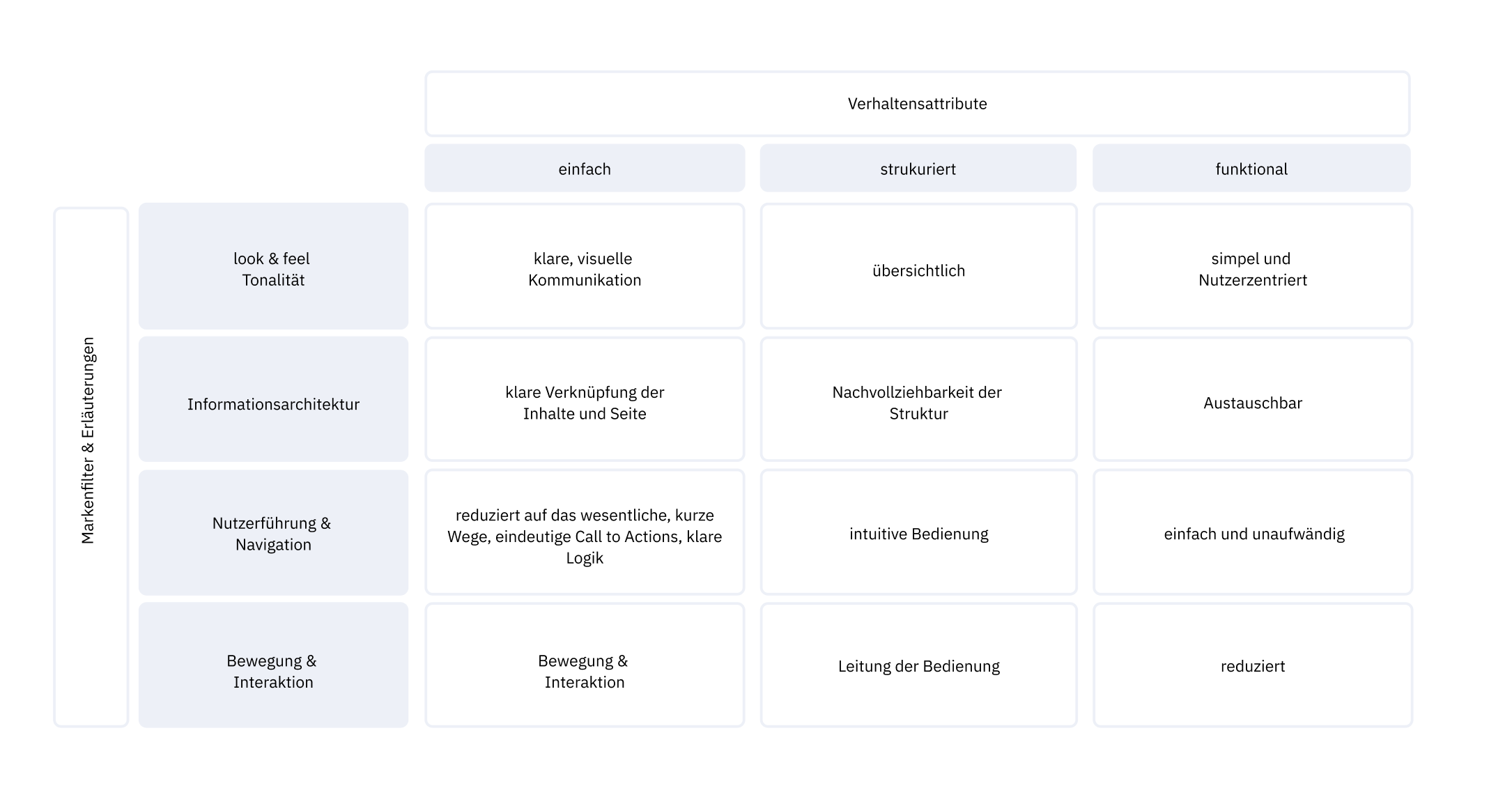
design filters
Defining the design filters as the cornerstore for the redesign
HOW MIGHT WE?
To better understand our users, we have created How Might We? for each group.
How might we make the search efficient?
How might we make the category clearer?
How might we make content more easily accessible?
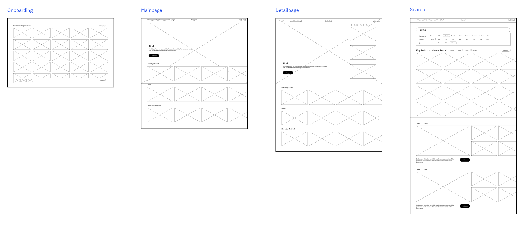
WIREFRAMES:
USABILITY TEST:
To make our ideas more concrete, we made wireframes. With these wireframes, we were able to perform usability testing to test our Delight feature.
improvements:
How to change the search again?
How can I delete the tags and the search again?
Create profiles
Onboarding: Possibility to skip
Tags for saved search
Separate different searches visually
positive comments:
Very clear
Would use the filter functions
TATORT:
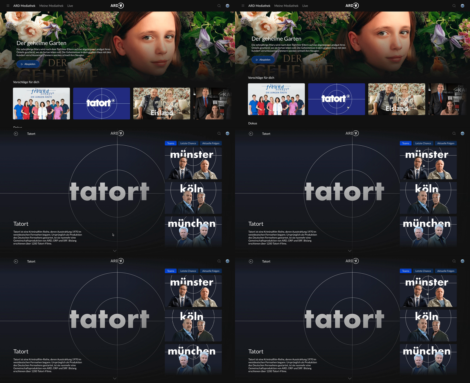
We have renewed and animated the Tatort logo as well as the Tatort thumbnails
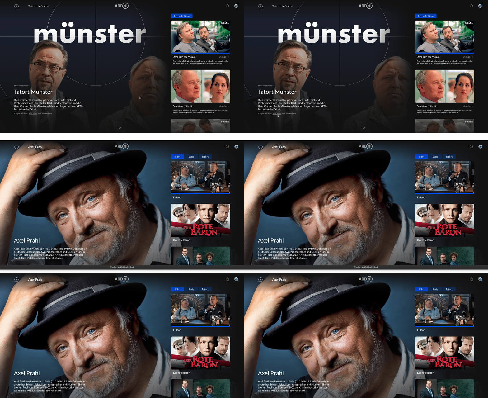
We design an actor page, which did not exist before
DELIGHT FEATURE:
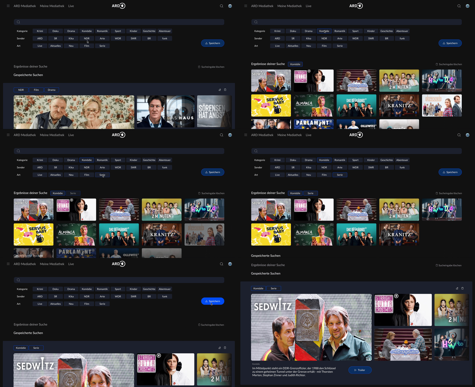
Search
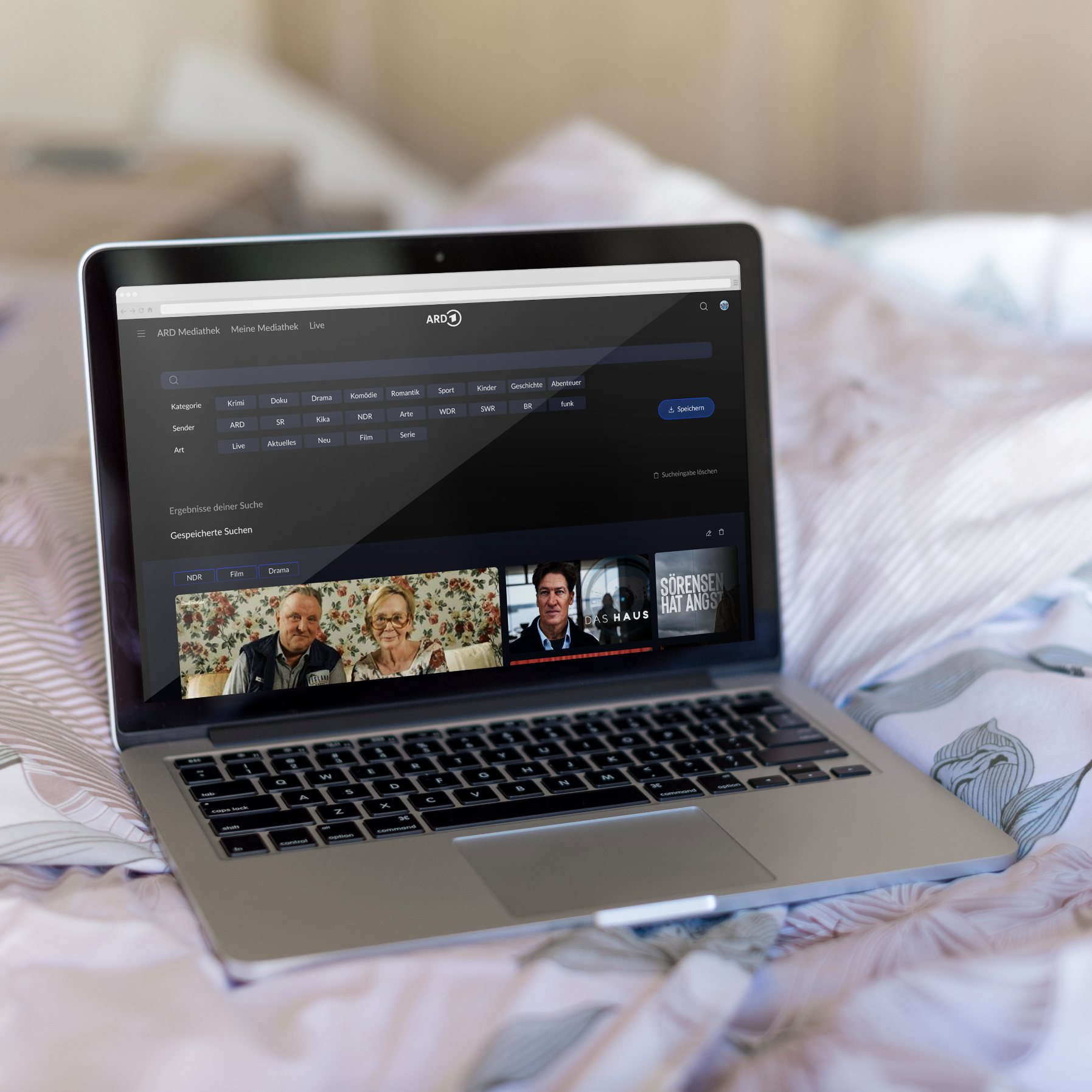
As the main deligth feature, we have chosen the search and developed it further. We focused on a simple and fast search, where you can search in categories, but also use the normal search.
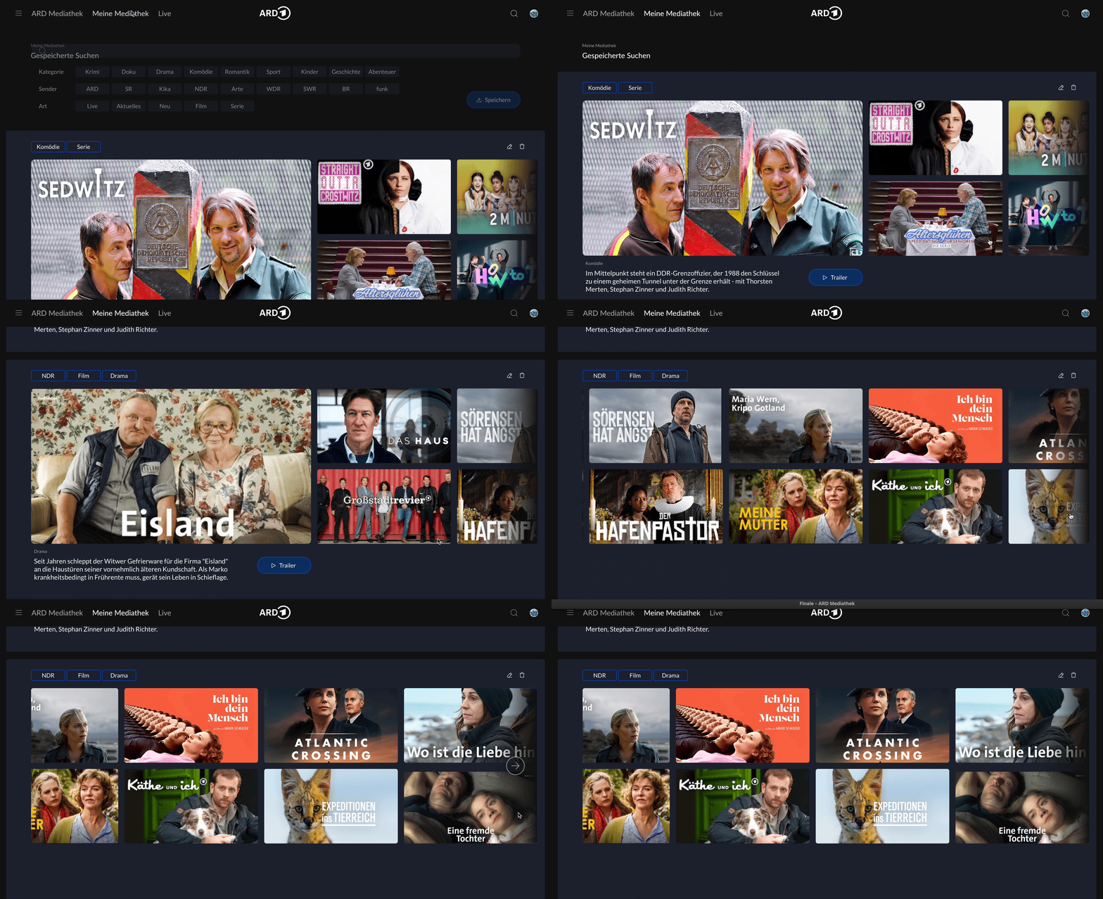
Seaved Search
In the process, a new function has been created: Saved search, which allows users to save search terms and conveniently call up only the content they need in an overview.
Finally, a new personalized ARD Mediathek was created, with a new and fast search. Through the “My Saved Search” you can quickly find your favorite content.
With the help of this video we were able to make our concept easily accessible and understandable.
