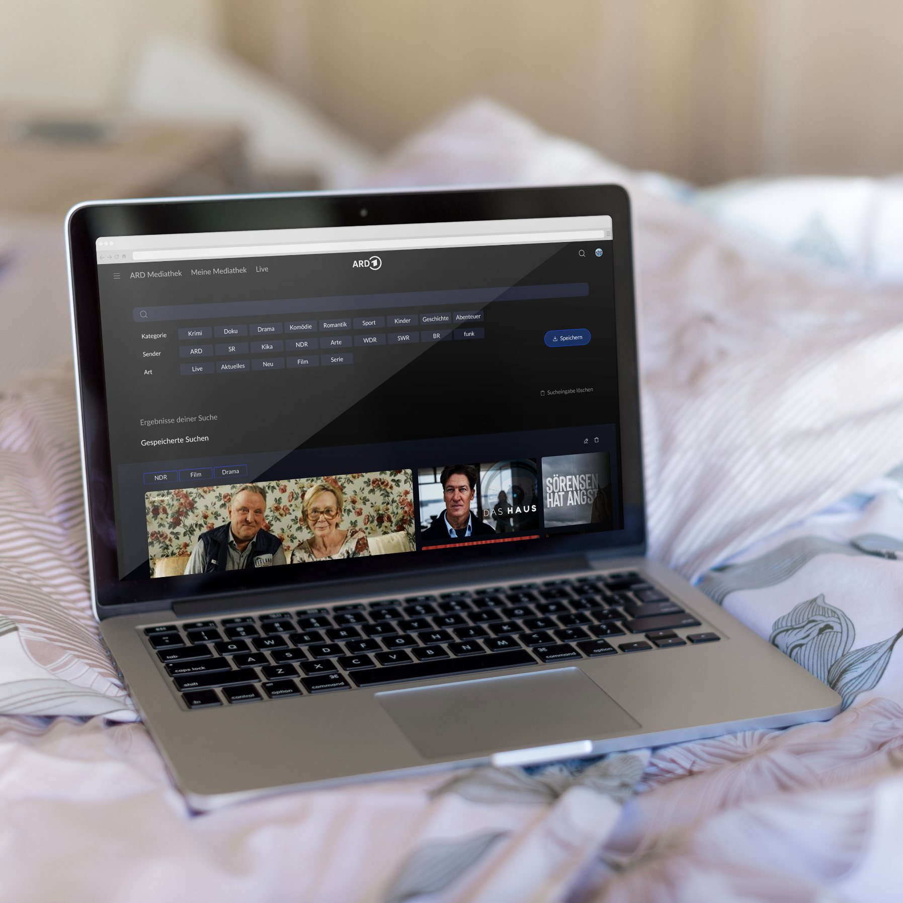
Bedrohung der Korallenriffe
Interaktive Kommunikationssysteme
TIME
mai. – july. 2022
COURSE
Interactive communication systems
TEAM MEMBERS
Jun Wang, Lena van Maris
SUPERVISION
Martin Wehl, Kai-Magnus Müller
TOOLS
Figma, Cinema 4D, Protopie
MY TASKS
Writing, Documentation, Design, Prototyping, Research, Concept of interaction
PROCESS:

GOAL
The user of our application should be educated about corals and their threats and be motivated to change his attitude towards life, for example regarding the use of plastic or overfishing, in an interactive and engaging way.
We wanted a topic that is significant and important for the future and also more topical than ever at the moment to draw attention to this issue.
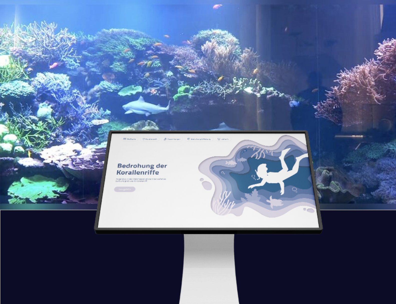
WORLD MAP:
Where are coral reefs everywhere and what are the different coral reefs? We distinguish between cold water corals and tropical corals and you can see where they are located.
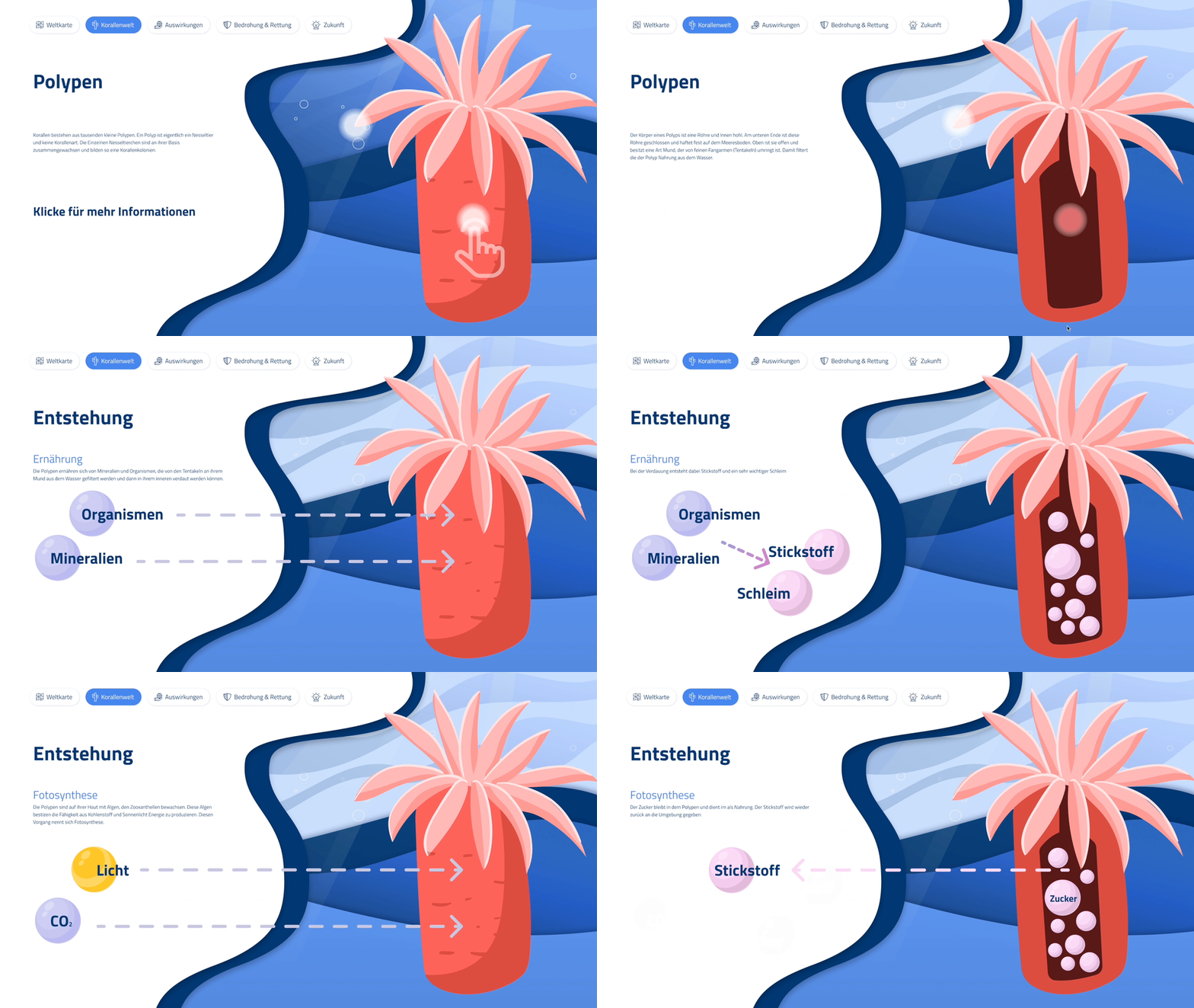
FORMATION OF THE CORALS:
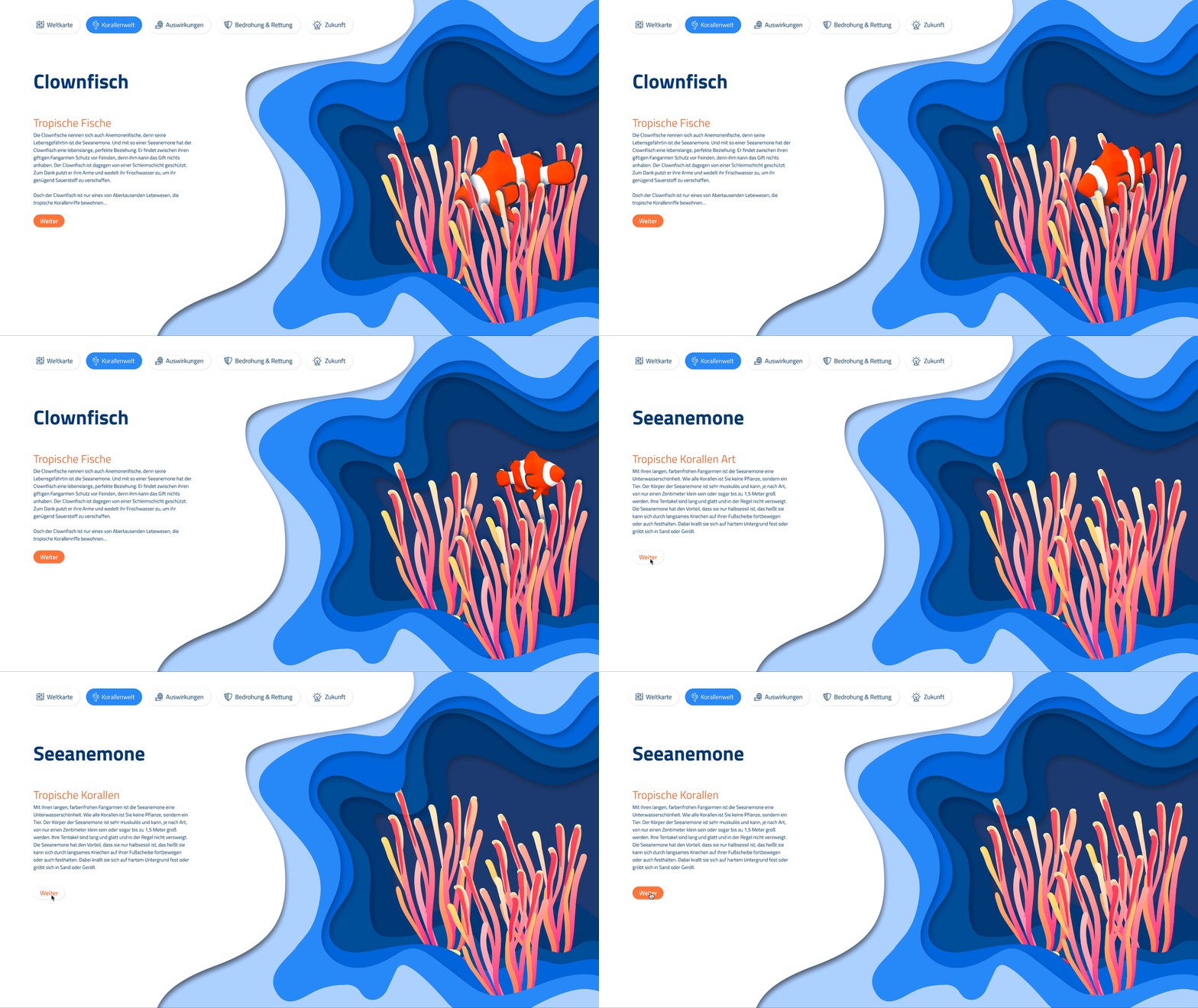
Learn how the corals are formed and their connection with the other fishes.
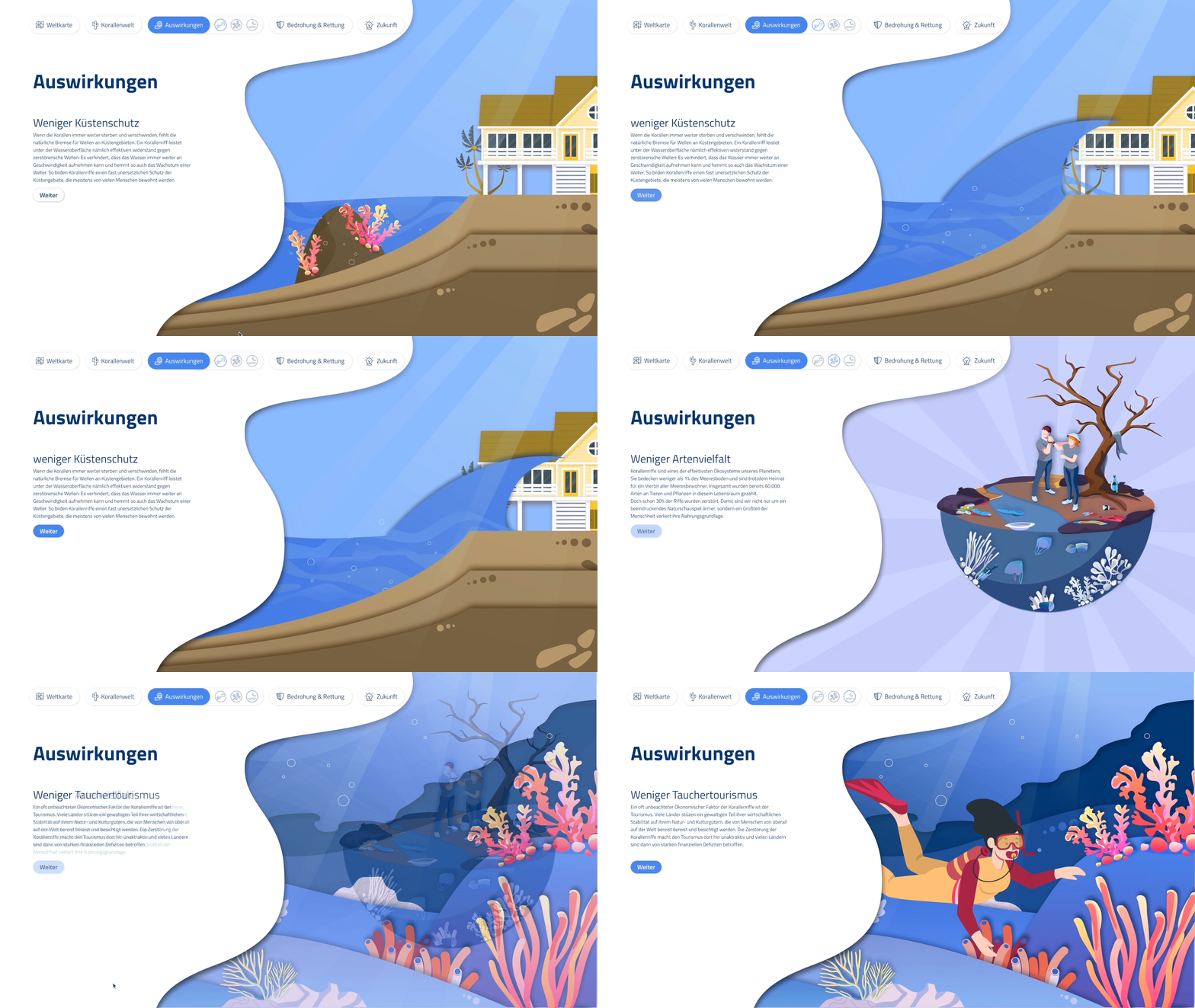
EFFECTS:
Learn about the impacts due to coral die-off for people and nature.

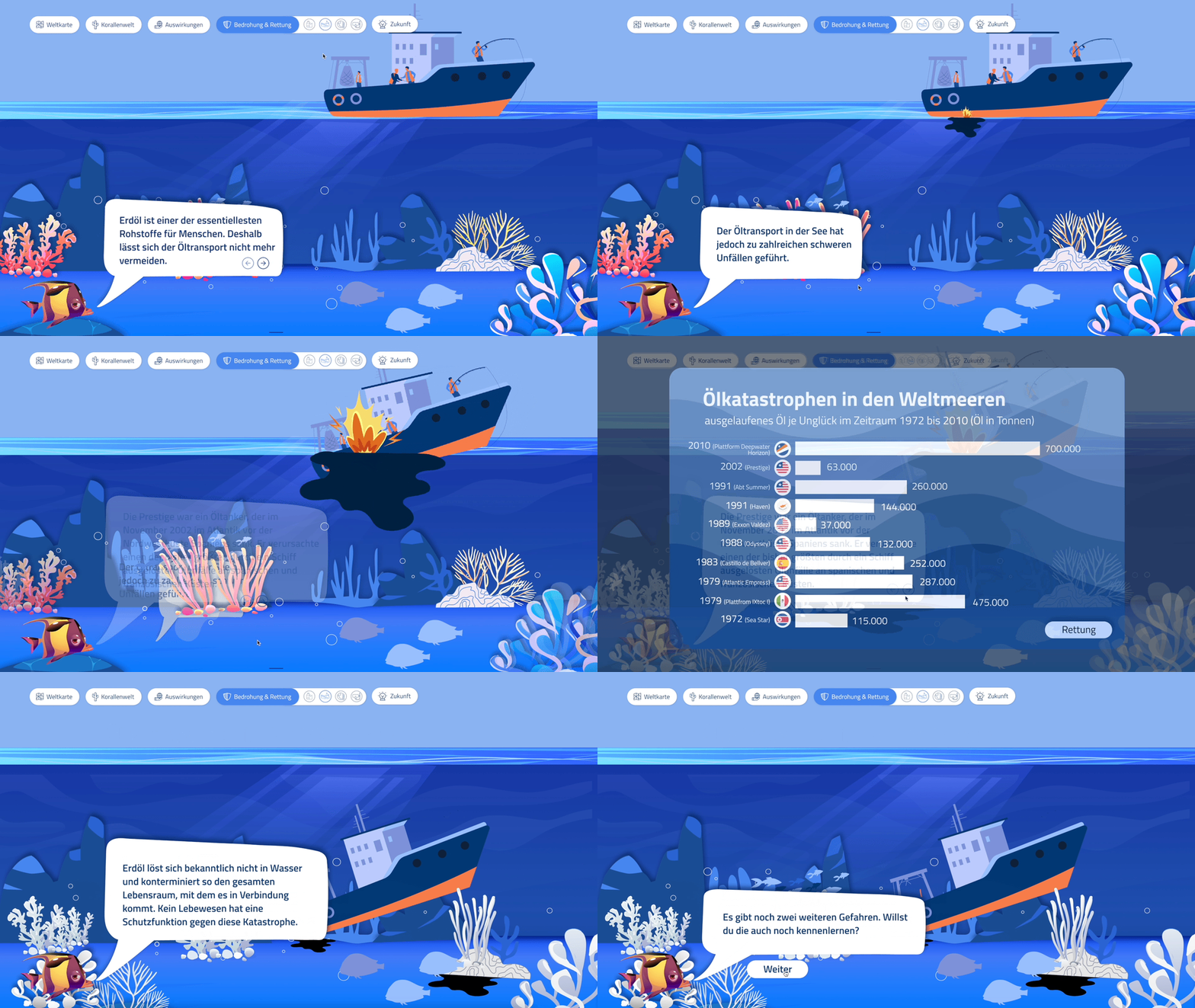
THREATS AND RESCUE:
Learn the dangers that threaten corals and how we humans can save them again.
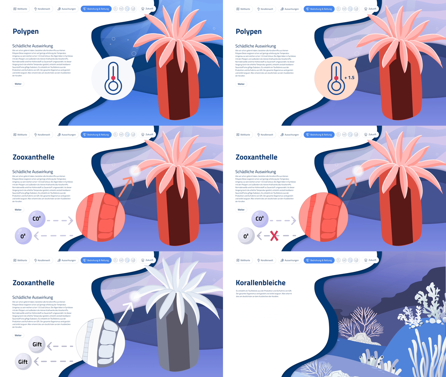
CORAL BLEACHING:
Learn how coral bleaching works.
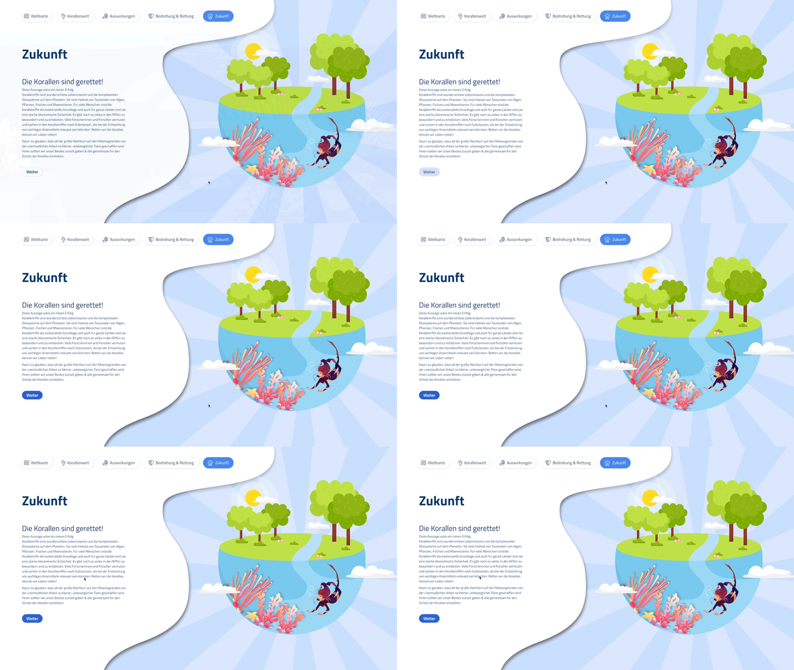
FUTURE:
Learn why we need corals in the future.
NARRATIVE FORM
Our narrative form is a linear and explorative narrative form. The storyline guides you through the application, but you can also use the navigation to explore everything.
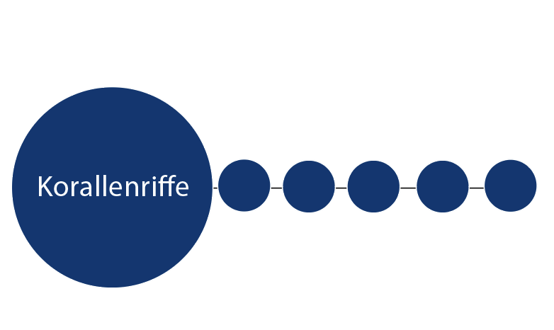
linear
explorativ
VISUAL DESIGN
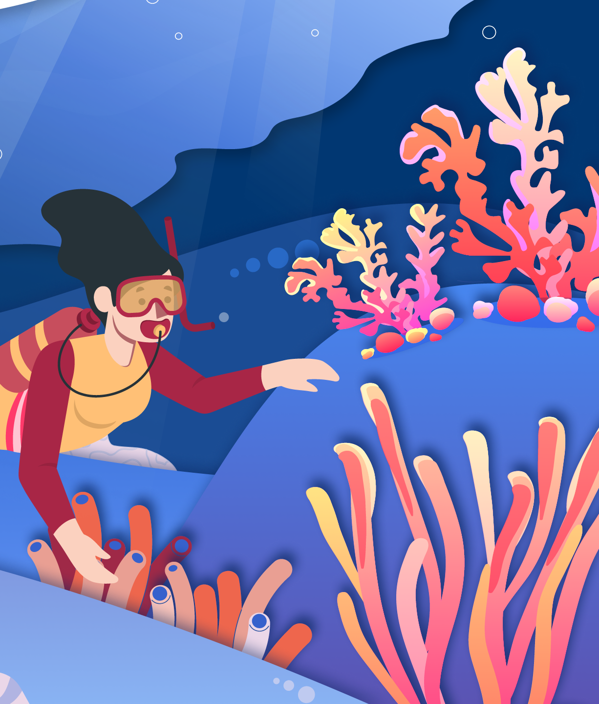
For the visual design, we limited ourselves to a 2D representation, marked with layers and shadows. Since our target audience is high school students aged 15-17, we also tended to use illustrations that are very colorful and easy to understand.
Our illustrations are very colorful and playful. We tried to use different layers and shadows to show depth to make the riff more real and interesting to highlight. For the most part, we tend to use less detail. However, at the points in our story where we want to explain and depict something in more detail, we then use the appropriate details.
The description of a project with adjectives is called the personality of the project. We thought of a lot of different adjectives that fit our application. For us these were important: friendly, direct, playful, educational and interactive.
friendly
direct
playful
educational
interactive
Finally, an interactive prototype was created in which one learns about the importance of corals and their dangers.
With the help of this video we were able to make our concept easily accessible and understandable.
