UnitedHands
A digital solution for coordinating volunteer helpers during reconstruction after flood disasters
PROJECT CONTEXT
Bachelorthesis & oct. – feb 2024/25
TOOLS
Figma, After Effects, Illustrator
SUPERVISION
Prof. Jens Döring, Prof. Ulf Harr
MY ROLE
Research, Concept , UI Design, Illustrationen & Icons, Prototyping
TEAM MEMBERS
André Jacoby, Elisa Moder, Lena van Maris
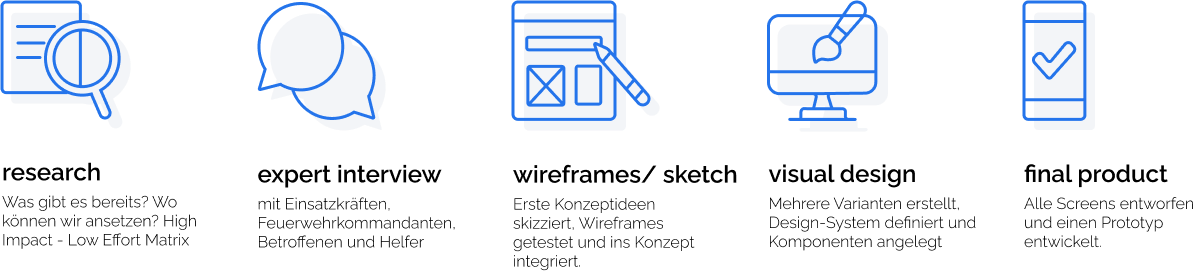
DESIGN
PROCESS
OUR
GOAL
UnitedHands revolutionises the coordination of volunteers during flood disasters and enables faster and more efficient support during reconstruction. In view of increasing flood events and the growing burden on professional emergency services, innovative solutions such as UnitedHands are indispensable.
The app relieves the burden on emergency services by organising and coordinating helpers – both experienced and first responders. Intuitive user guidance makes it easy to get started and motivates long-term participation.
OUR
PAINPOINTS
To uncover real user needs, we conducted interviews with a variety of stakeholders — including fire service leaders, volunteers, flood victims, and those responsible for digital systems.
By tailoring our questions to each group’s experience, we gained a deeper understanding of their challenges, goals, and workflows during flood emergencies. These conversations revealed recurring pain points that shaped the foundation
of our problem space and guided our design decisions.
Lack of Orientation
Volunteers arrived without clear direction and didn’t know where to go, who to talk to, or how to start helping.
Unclear Task Structure
There was no central overview of tasks or needs. Volunteers were left waiting or sent away without guidance.
Missing Communication
Volunteers didn’t know who was in charge, had no overview of the situation, and risked working against official efforts.
Missing Task Info
Volunteers didn’t receive enough information about the task such as required tools, clothing, or time commitment.
Disruptive Timing
Volunteers arrived too early, often without coordination, and unintentionally disrupted or delayed emergency operations.
No Task Handoff
After completing a task, volunteers were left without follow-up instructions, leading to confusion and inefficiency.
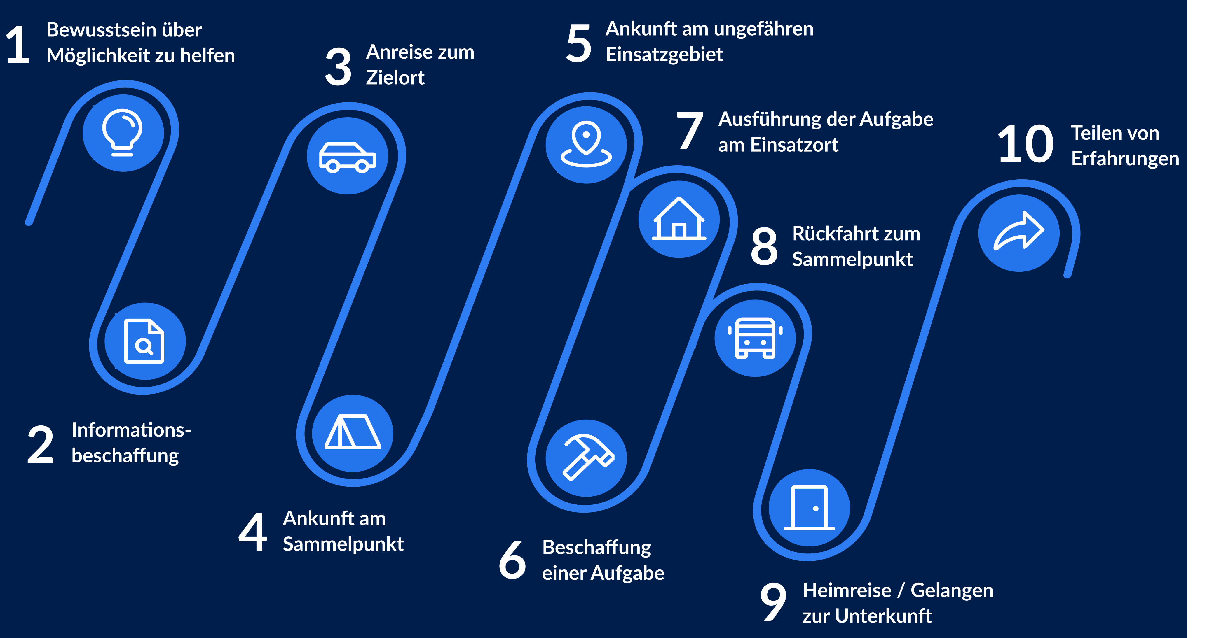
USER
JOURNEY
The user journey was always at the centre of our project. It enabled us to analyse the processes and phases of all three stakeholder groups in detail in the context of a flood disaster. The user journey served as a central basis that we could refer back to again and again in order to review processes and retrospectively validate our ideas. When creating it, we integrated important findings from interviews, pain points and other aspects in order to specifically identify those areas of the user journey in which we wanted to start. We recognised particular potential in the area of task distribution, where we wanted to develop a concept for the efficient creation and assignment of tasks.
OUR
CONCEPT
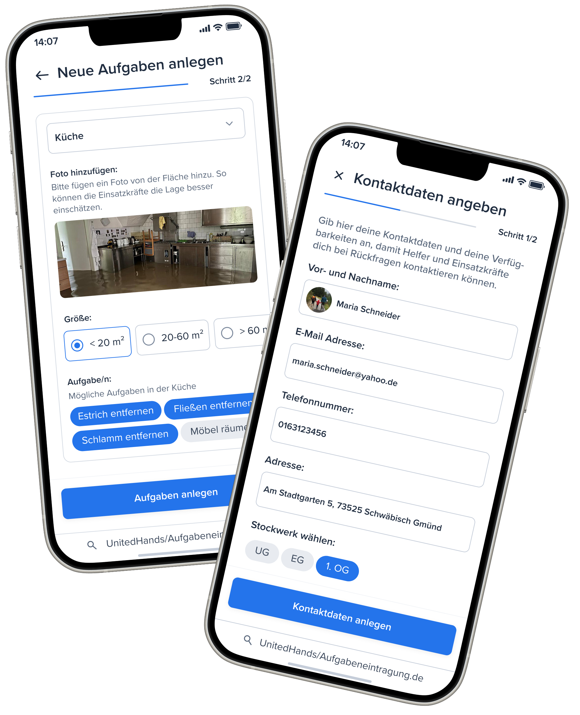
Those in need can submit their requests directly on our website. To do so, they provide their contact information so that volunteers can reach them in an emergency. They then create requests for the affected areas. Based on this information, we estimate the number of volunteers needed, the tools required, and the duration of the task. Volunteers can receive these requests in two ways: through our app or on-site via the terminal.
THE APP
The app relieves the burden on emergency services by organising and coordinating helpers – both experienced and first responders.
An intuitive user guidance makes it easy to get started and motivates long-term participation.
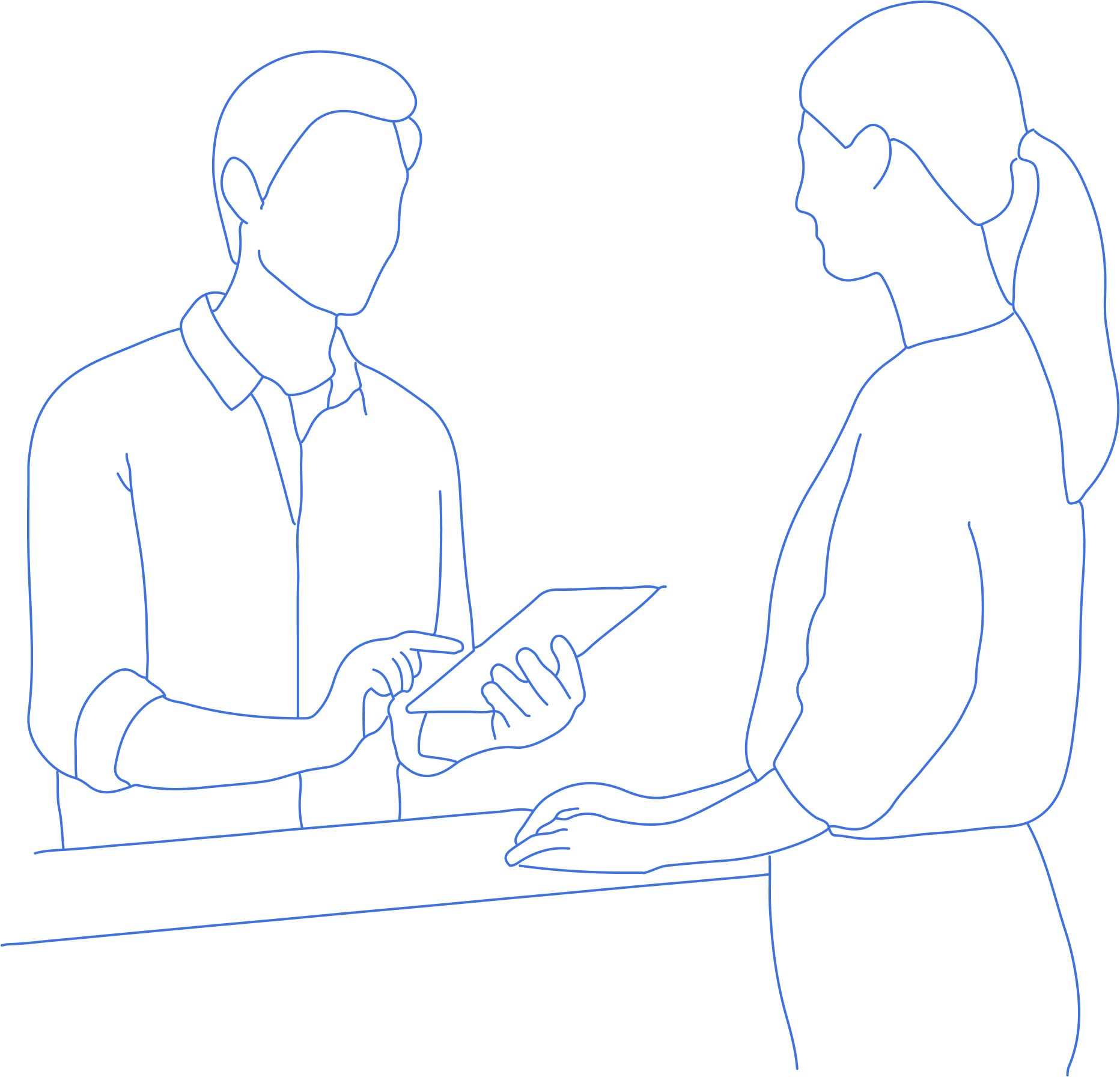
THE TERMINAL
Even though the app makes many things easier, there will always be volunteers who don’t use it or who come directly to the site. That’s why we’ve also made provisions for these volunteers: At the supply center, there’s an information desk where staff can see an overview of all tasks and assign volunteers accordingly. Volunteers receive their assignments on a printed A4 sheet, so they can still participate effectively.
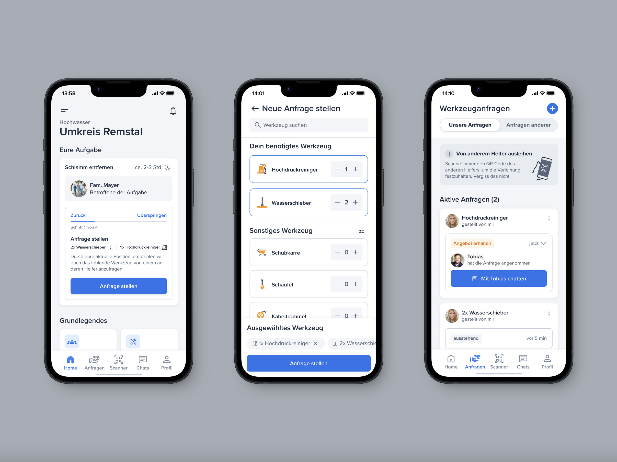
THROUG THE APP
GUIDANCE
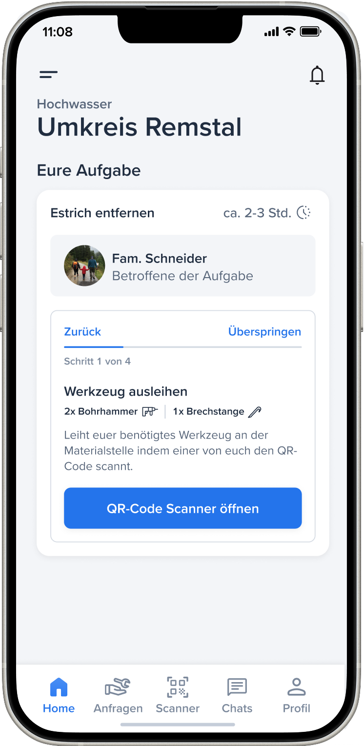
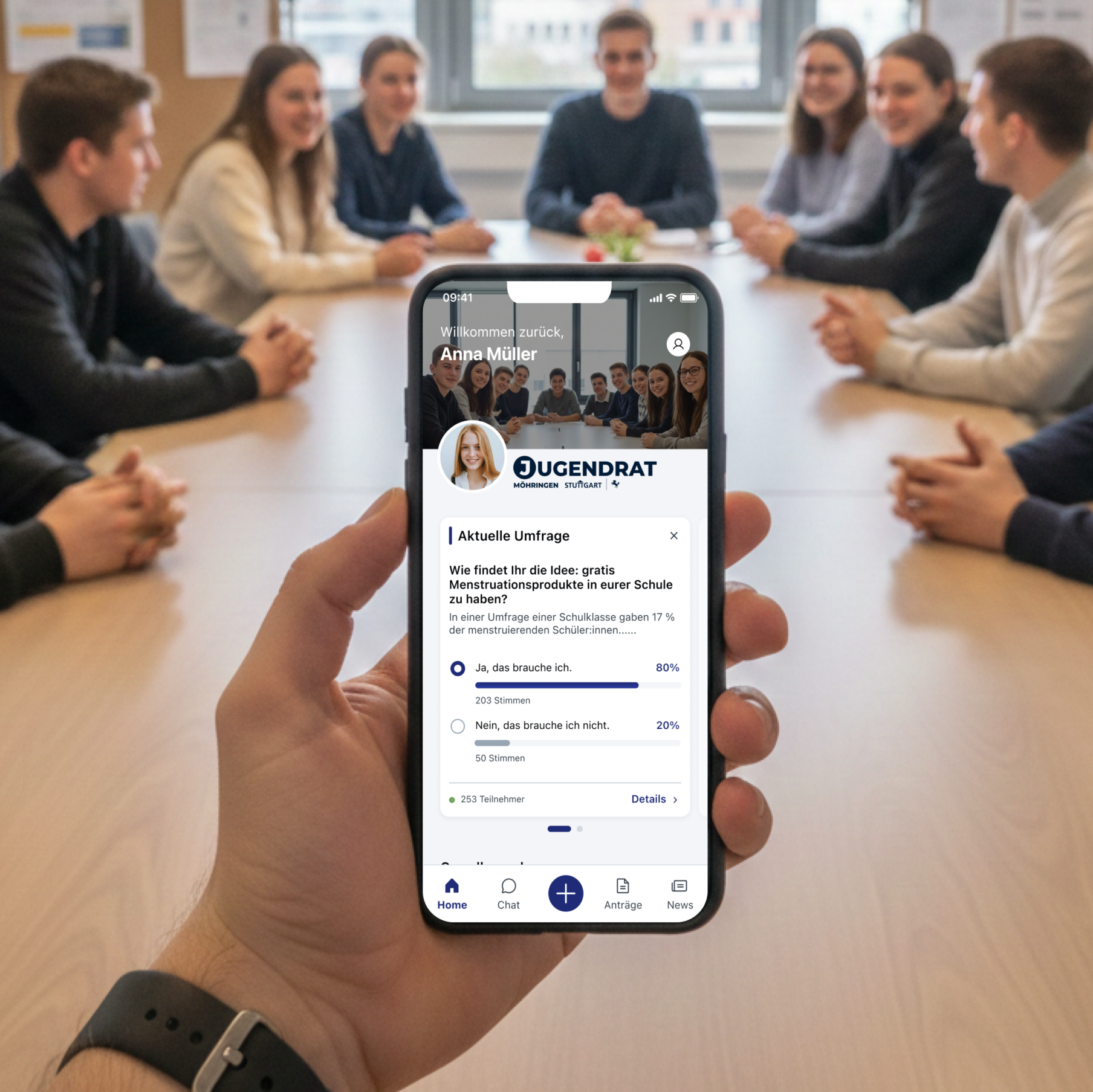
With UnitedHands, we create a balance between clear coordination and flexible initiative. Our app not only gives helpers an overview of the most urgent tasks, but also shows them specifically what they can do next. At the same time, we deliberately leave room for manoeuvre, for example when procuring materials, so that helpers can act independently. This enables us to offer structure and security without restricting the flexibility and motivation of the volunteers.
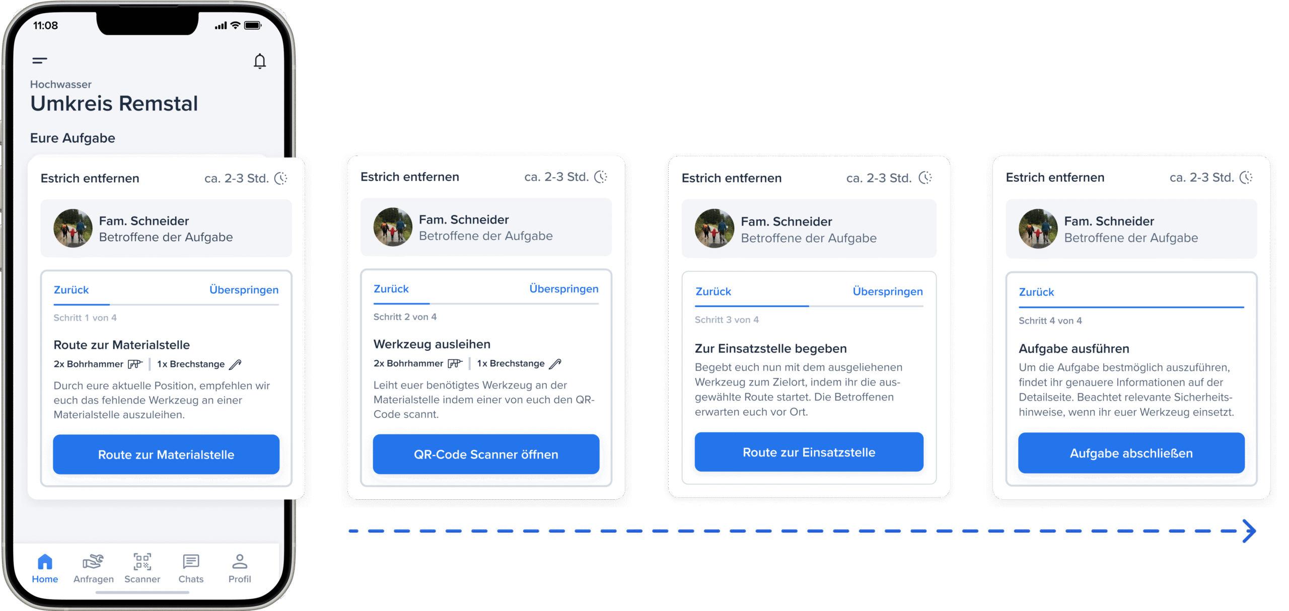
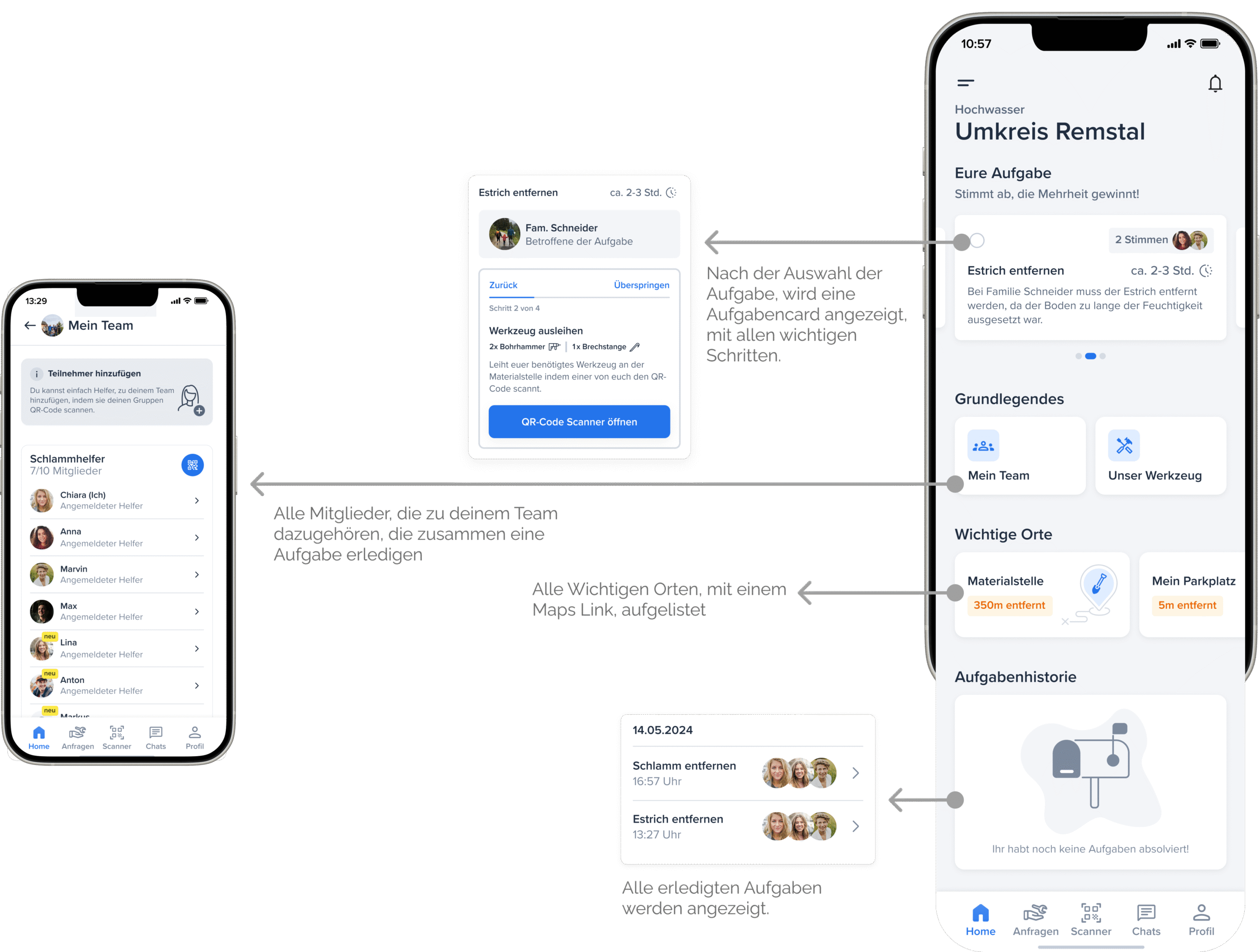
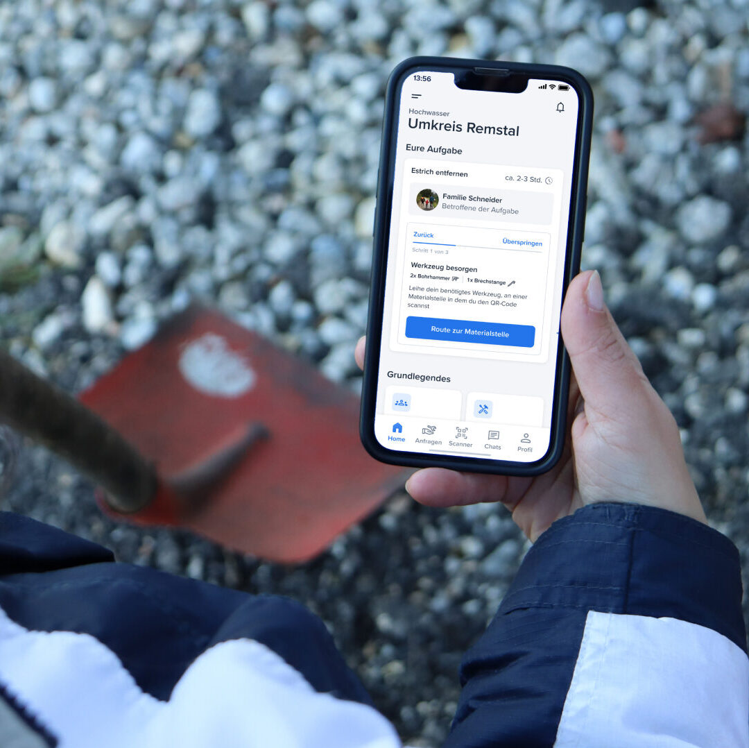
The task card is the core of our app. It clearly defines the next step and connects it to the main action button, ensuring intuitive and efficient coordination. Helpers always know what to do next. Our call to action is based on a dynamic principle.
OUR
FEATURES
01
/05
ONBOARDING
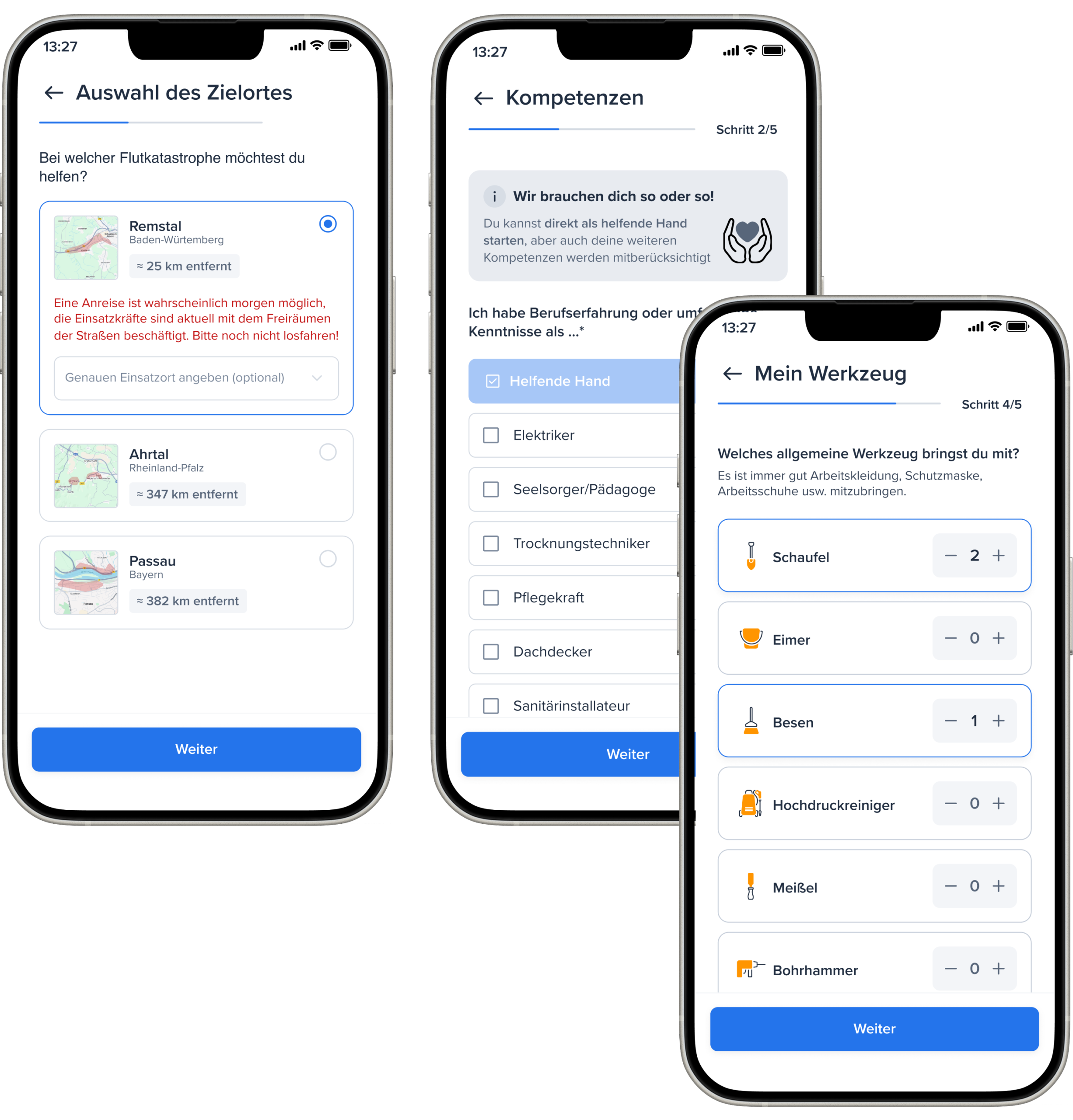
During onboarding, volunteers provide basic information, their area of expertise, tools, and experience, which allows suitable tasks to be pre-filtered. Travel arrangements with friends can also be specified and used to create groups.
02
/05
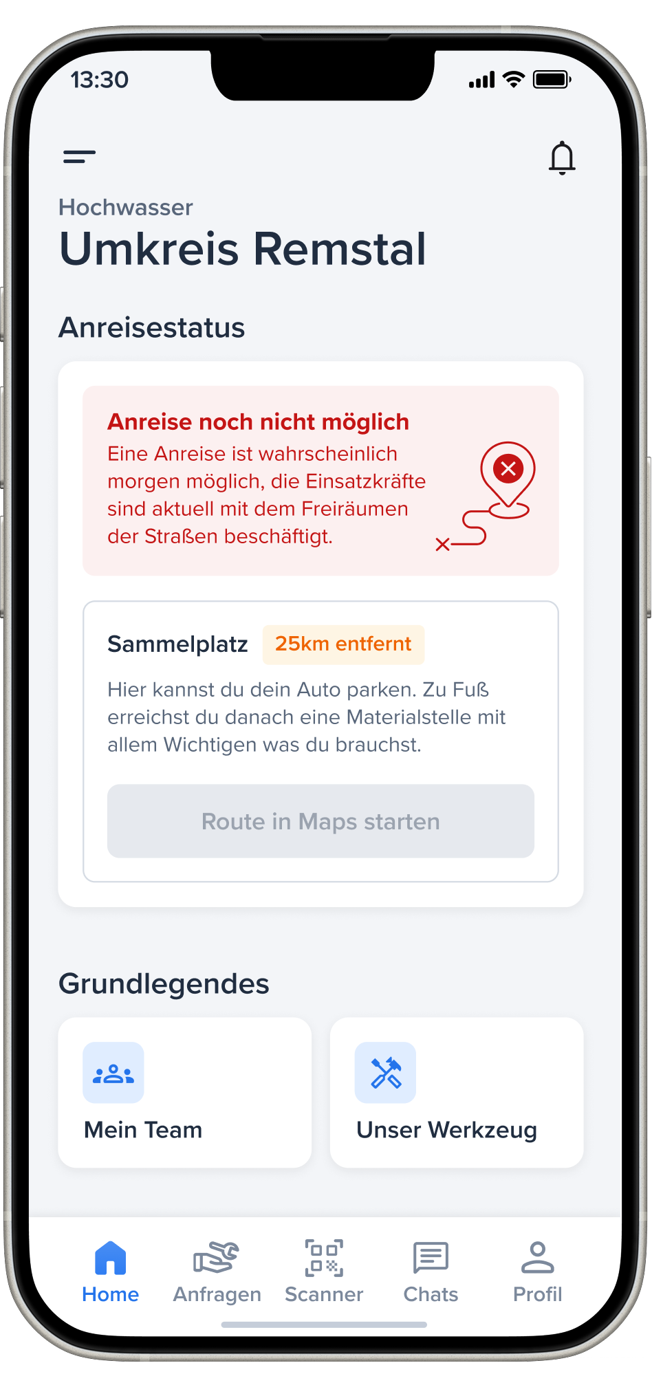
ARRIVAL STATUS
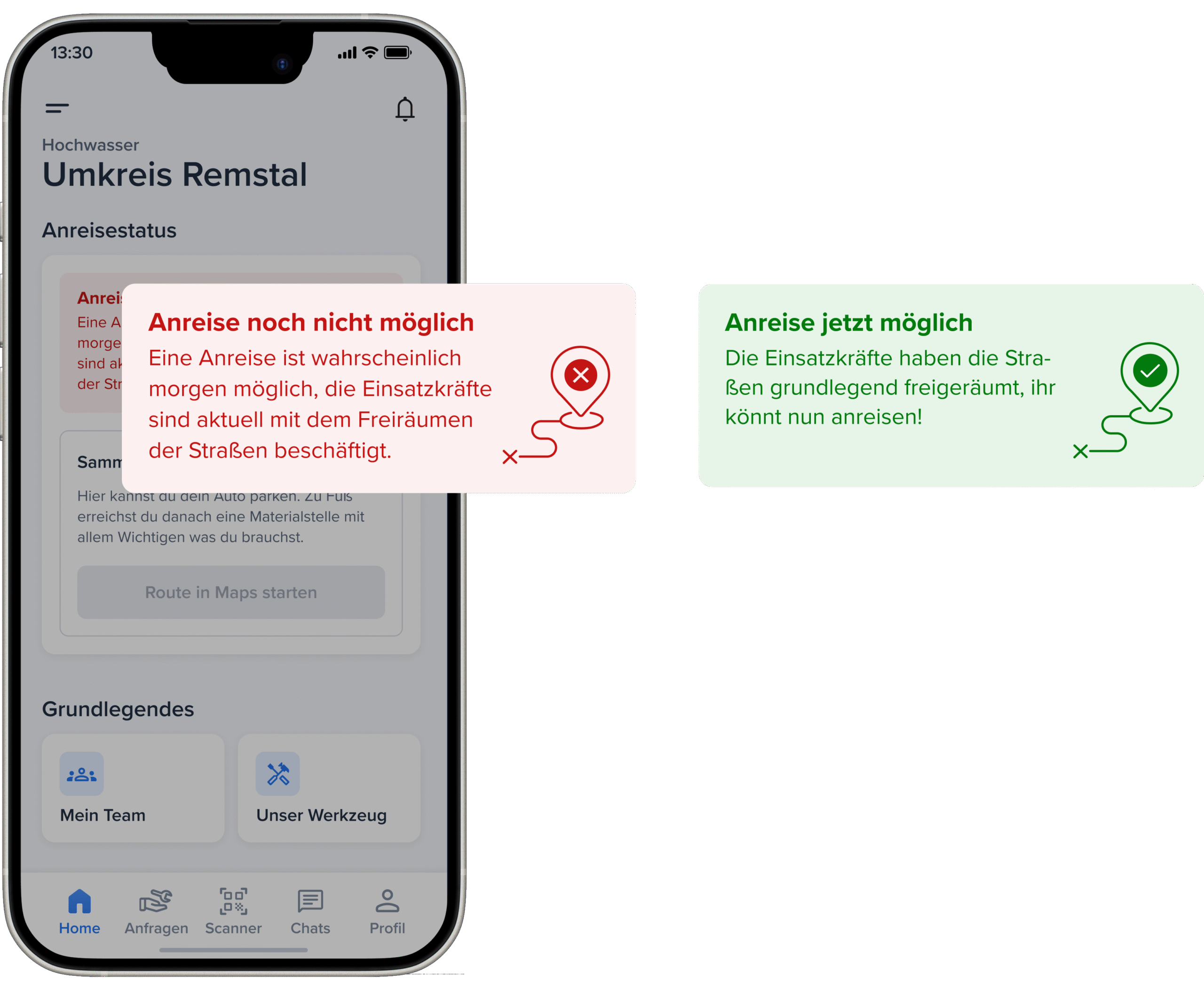
A key problem was the premature arrival of helpers, which can hinder emergency services. Therefore, an arrival status indicates when it is appropriate to arrive. Only after approval is the route to the meeting point visible.
03
/05
HOMESCREEN
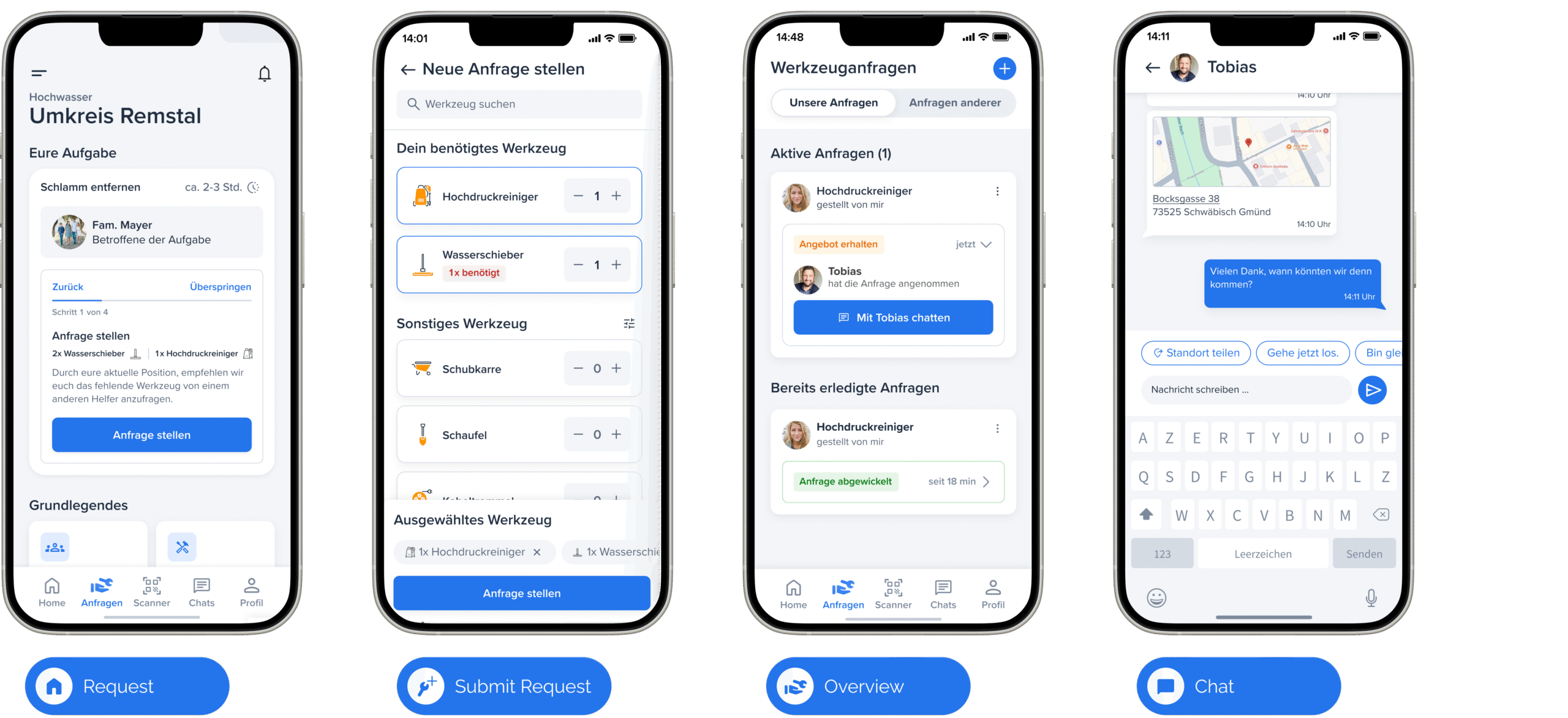
After onboarding, helper groups choose from three tasks. The majority decides, and the selected task is highlighted. Clicking on the task card shows further details.
04
/05
TOOL INQUIRIES
To promote community and flexibility, helpers can share tools with each other. This saves them a trip to the tool station. Requests are visible to everyone who owns the required tool.
05
/05
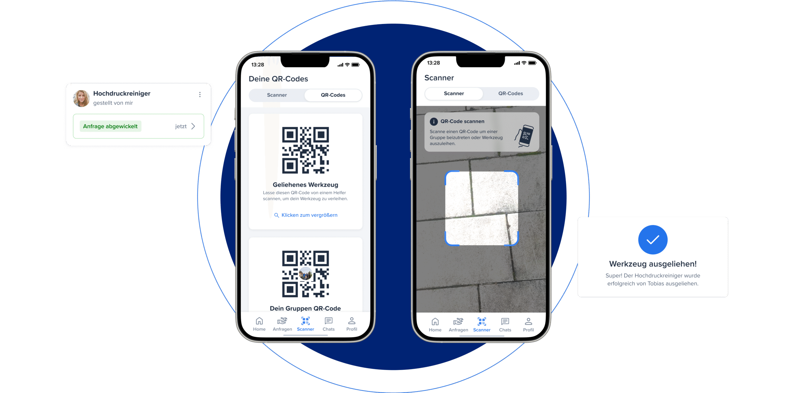
SCANNING QR CODES
By scanning the QR code, the transfer of materials is logged or helpers are added to the permanent team.
OUR
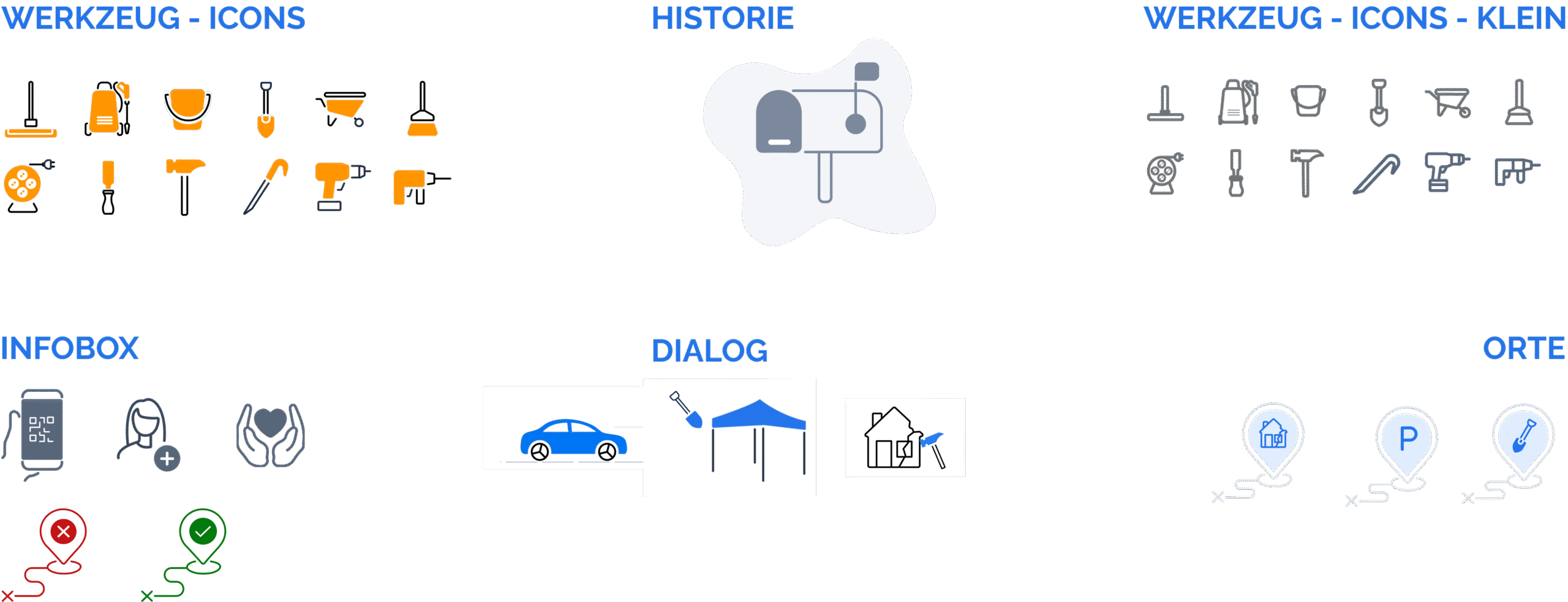
ILLUSTRATION & ICONS
We initially worked with an existing icon set, but quickly realized that it didn’t cover the wide range of tools we wanted to represent in a single, cohesive style. Since there wasn’t a ready-made set that met all our needs, we decided
to create our own custom icons. I took on the design of these icons, as well as many of the illustrations throughout the app. To add more character, we experimented with colorful icons. However, for smaller use cases, we also designed
a simplified, gray-toned version that works better at compact sizes.
Creating these visual elements is something I genuinely enjoy — it’s where my background in graphic design really comes into play.
In the end, a concept, a kit and an app were created, which is visualized in this video.
With the help of this video we were able to make our concept easily accessible and understandable.
_____________________________________________________
WHAT DO YOU WANT TO SEE NEXT?
______________________________________________________
Younite
UnitedHands
Radial Calculator
dufte
Pal Fridge